STUDENT PROJECT
ZENLY CASE STUDY

INTRODUCTION
Zenly is a social mapping network that uses its own mapping data, video game technology, and a 3D camera to offer users a personalized view of the world. The app allows users to track their closest friends in real time, providing an exact, live update of their friends' locations.
In this case study, my team and I examined the problems with the current state of Zenly (2022) and revamped the app in a Figma Prototype. The entire project was completed in six weeks.
ROLE
My role in this project is creating the user personas and the low fidelity prototype. I also assist in the heuristics evaluation and making the medium fidelity prototype.
FEATURES OF ZENLY

Mapping
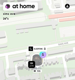
Zenly lets you recenter your map, view recent highlights, track your locations, and share favorite memories with friends

Searching
Zenly's search feature lets you find friends, see their location, companions, visit duration, and battery status. It also helps you find nearby places like bars and restaurants

Messaging
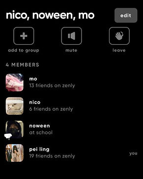
Zenly enables in-app contact with friends through individual and group chats, supporting up to 100 people per message. You can start conversations, share pictures or videos with location tags, and prompt friends to respond similarly
PROBLEM STATEMENT
The current UI of Zenly is cluttered and overwhelming, leading to confusion and difficulty in navigation. Users find it challenging to understand new features and icons, even after weeks of use. The application does not feel like a social app due to its lacking features.
GOAL
Redesign Zenly's user interface to be cleaner and more intuitive, enhancing ease of navigation and feature discovery. Simplify iconography and onboarding processes to improve user understanding. Introduce new social features to make the application feel more engaging and community-focused, ultimately providing a more seamless and enjoyable user experience.
PROBLEM STATEMENT
The current UI of Zenly is cluttered and overwhelming, leading to confusion and difficulty in navigation. Users find it challenging to understand new features and icons, even after weeks of use. The application does not feel like a social app due to its lacking features.
HEURISTICS EVALUATION
For this project, we decided to use Jakob Nielsen's 10 heuristic principles to evaluate Zenly's UI/UX based on the survey that we conducted results.

.png)
Help and Documentation
Visibility of System Status
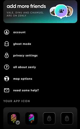
Zenly's simple UI hides key functions, including the help feature, making them difficult for users to find without thorough exploration
Unlock my world" is a key feature of Zenly, tracking places users visit. However, it lacks proper explanation, leaving many users unsure how to access it despite frequent prompts
Match between the System and the Real World
User Control and Freedom
.png)
Some of the icons used do not match their intended purpose/features
_edited.jpg)
Zenly randomly adds a group of friends to a group chat when they are nearby and do not allow users to remove people or delete the existing chat until they have left the group
User Control and Freedom
_edited.jpg)
_edited.jpg)
The placement of the “X” button is never at the same spot. It’s sometimes placed at the bottom of the screen and sometimes at the side of the screen.
Aesthetic and Minimalist
_edited.jpg)
The displayed information is poorly formatted because the lettering is inconsistent, with some being all lowercase and others being all uppercase, confusing the user and making it difficult to read.
USER PERSONAS AND REQUIREMENTS
We created three user personas based on our target audience, each with a distinct personality and unique reasons for using the app.
.png)

Michelle Lim, a 16-year-old student, aims to become an online influencer. She enjoys hanging out with friends and posting content but struggles with finding trendy spots and staying connected. She needs an app that introduces new locations, helps create content, and allows sharing across social media platforms.
.png)

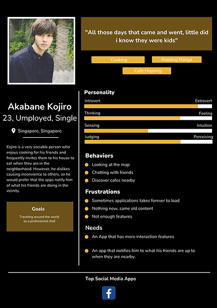
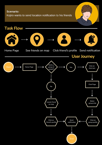
Akabane Kojiro, a 23-year-old unemployed graduate from Singapore, loves cooking and café hopping. He enjoys socializing with friends but dislikes inconveniencing them. He needs an app to notify him of nearby friends and their activities to plan get-togethers. His frustrations include slow applications and lack of new features.
.png)

Jenjira Yang, a 28-year-old married woman from Singapore, enjoys shopping and blogging. She needs an app with a simpler UI to track her husband's location and battery status. She struggles with the current app's complex UI and difficulty in use.
TASK FLOW AND USER JOURNEY
Based on the user personas and their requirements, we developed a task flow and user journey to better understand our users. This helps us tailor the app's features and interface to meet their specific needs.
%20(2).png)
.png)
%20(3).png)
LOW FIDELITY PROTOTYPE
Based on the task flow and user journey, we created a low-fidelity digital prototype to redesign the application's flow and layout. This prototype also includes new features aimed at enhancing the user experience and addressing user needs.
_edited.jpg)
MEDIUM FIDELITY PROTOTYPE
We then moved on to creating a medium-fidelity prototype in Figma to determine the scaling of the UI and get a clearer picture of how the final product will look. This step helped us refine the design and ensure that all elements are appropriately scaled and positioned.


AB TESTING
Before creating our high-fidelity prototype, we conducted A/B testing using mockups to ensure that the finished product meets users' needs and is aesthetically appealing. This testing helped us validate design choices and make necessary adjustments based on user feedback.
Icon Testing
%20(2)_edited_edited.jpg)
Using icons that are commonly used in other applications.
_edited.jpg)
Using icons that are literal to their meaning (eg. story icon = storybook)

Users are confused with icon’s functionality. Some of the icons are not intuitive and can have multiple meanings

Users are able to tell what the icon’s functionalities are as they have experience using the same icons in other applications
By using icons that are similar to other well known applications, users are able to navigate around the application easily.
Title Wording Testing
_edited.jpg)
Having a more "hip" title as most of the targeted users are young adults

Users find the application hard to understand and is confused about some of the titles. Some users also comment that it is a bit childish
%20(2)_edited.jpg)
Having a direct title

Users are able to understand what each page and popup in the application functions are
By having a more direct title/header for the application, users are able to navigate the application easier.
FINAL DESIGN
Project Restropective
Here are the key takeaways that we have learnt from this project :
-
Research and analysis are crucial in any design project. They provide a deep understanding of user needs, behaviors, and pain points, ensuring that the design is user-centered. By conducting thorough research and analyzing data, we can identify key trends and insights that guide our design decisions. This foundational step helps in creating solutions that are both effective and relevant, reducing the risk of design failures and enhancing overall user satisfaction.
-
Aesthetics play a vital role in user experience, significantly impacting how users perceive and interact with a product. An appealing design can attract users, evoke positive emotions, and create a memorable experience. It also contributes to usability; a well-designed interface can make navigation intuitive and enjoyable.